Overview
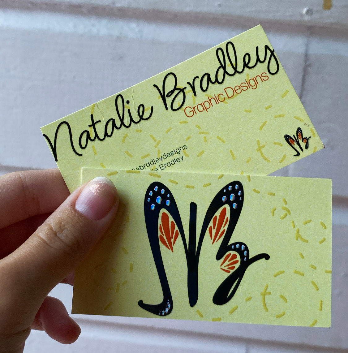
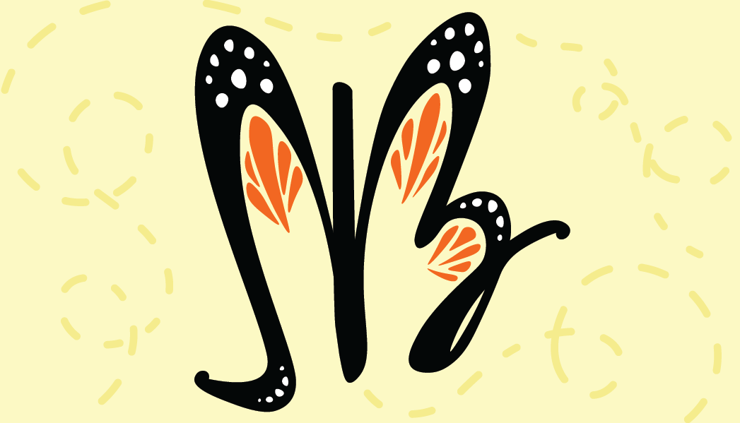
For a designer or anyone starting their own brand from scratch it can be kind of complicated. Branding is so important because it communicates to others how you want to be perceived. When I first started designing my logo my first thought was to incorporate a bee. Bees are symbolic for me. While I was first working on my bee logo, it didn't feel right. So I switched my thought process and started playing around with just my initials in a cursive font. Typically when I sign my artwork, I sign my initials to where they overlap slightly. When I did this I noticed I could create some unique shapes. Eventually, I ended up reflecting the cursive N and overlapping the N and B so that it created a sort of butterfly shape. After I achieved the desired shape, I started playing with color. The color yellow symbolizes light, joy, happiness, imagination, and hope. This really resonated with me so I decided I wanted to to incorporate yellow but, I still wanted to incorporate a secondary color. Which is when I decided on orange. Monarch butterflies symbolize transformation. While starting freelancing on my own, I felt as though I was going through my own transformation or rebirth.
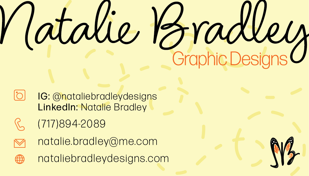
In the final print of my business card I wanted to add some embellishments to make my business cards stand out. The front of the business card (Logo) has a gloss embellishment over the black and orange parts of the butterfly. The dotted lines are also gloss embellished. The dots on the "wings" of the butterfly are silver foiled which adds a unique flicker in the light. The back of the business card has gloss embellishment on the name and the small logo in the right corner. To create the embellishments on the cards I added a mask layer through photoshop that communicates to the printer what will be embellished. Embellishment in print is something new that I discovered I could incorporate into my designs. It adds a touch of uniqueness but can also be used for adaptability.
Adobe Illustrator and Adobe Photoshop